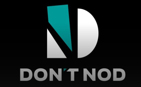
 After being in business for more than 13 years, DONTNOD Entertainment has made the decision to rebrand itself, both in name and visual identity, as simply “DON’T NOD”.
The studio, most recently known for the award-winning Life is Strange series, has made news by adding a new studio, dipping a toe into the publishing space and becoming a modern fully remote workplace — summed up by FROG (Fully Remote Organization).
Check out a video regarding the announcement along with information on their evolution below. Hop on over to their new site too, right here: www.dont-nod.com
A fresh look for DON’T NOD – Exploring our new visual identity:
DON?T NOD ? previously known DONTNOD Entertainment – celebrates its 14th year of creating meaningful narrative games. As we have evolved consistently since inception, we have undergone a visual rebranding as part of our ongoing evolution to better reflect who we are as a company today.
It is an exciting time for DON?T NOD and to share this excitement with you, we have produced a reel to showcase our new logo. It is an adaptable design and can be tailored to represent our different game genres and universes, and it just so happens we have several upcoming projects to test its versatility on…
NEW VISUAL IDENTITY
In recent years, the company has undergone some foundational changes: namely the addition of our Montreal studio and our expansion into games publishing, which brings the company to around 320 talents in France and Canada that benefit from greatly improved flexibility through our innovative FROG (Fully Remote Organization) scheme. Dontnodians are all working in several human-sized teams working on six internal projects. Not only do we self-publish our games, but those of third-party developers who share our editorial vision, by offering our support in bringing their creations to life. These changes, amongst others, encouraged us to build a new, more fitting visual identity to carry us forward.We are reintroducing the apostrophe and the space between the words to truly embrace the meaning of DON?T NOD. DON?T NOD is two words to represent our tendency to be non-conventional as a company and in the games that we create ? as in, we DON?T NOD along to everyone else?s tune. The D is shattered, and the N appears within it, signifying that we are not afraid to break the mold. This new logo links our games ? meaningful, powerful stories ? with who we are as a company.
?I am very proud of the journey that DON?T NOD has been on over the past 14 years. The company has evolved in many ways with a strong will to lead the way in creating and publishing meaningful entertainment, through original and relatable stories, which empower our talents and players to inspire change, however small. This new brand?s visual overhaul will help us convey our core identity.? says Oskar Guilbert, CEO of DON?T NOD.
BRAND-NEW WEBSITE
To accompany this new visual identity, we have launched a brand-new website to replace our previous one. The site connects us with players, who will be able to easily step into the universes of all our games and access exclusive content, behind-the-scenes snippets, and the latest news. It is also a space for our future talents and partners to see who we are, how we work, and how to work with us.Our community is very important to us, and so we are happy to introduce our tailor-made user submission tool on a dedicated community page, where players can submit their own fan-made creations ? art, testimonies, poetry etc. inspired by their favorite DON?T NOD games ? to have their work featured on the website itself. We are always awed by our fans? talent and are proud to showcase it.
Check out our new website here: www.dont-nod.com
To stay up to date with further news, follow DON?T NOD on Facebook, Twitter, Instagram, and LinkedIn.

