Also On: PC
Publisher: Forever Entertainment
Developer: Forever Entertainment
Medium: Digital
Players: 1
Online: No
ESRB: M
The nicest thing I can say about Hollow is that at least I could tell what its developers were going for. The game was clearly inspired by the likes of Alien: Isolation and Dead Space, and, like them, it wants to be a creepy space horror game, the sort of thing where the tension of wondering what?s around the next corner and the claustrophobia from being trapped inside an enclosed space with no way to escape are at least as frightening than any monsters or demons you may encounter.
That?s the thinking, at least. The reality, unfortunately, comes nowhere close to that.
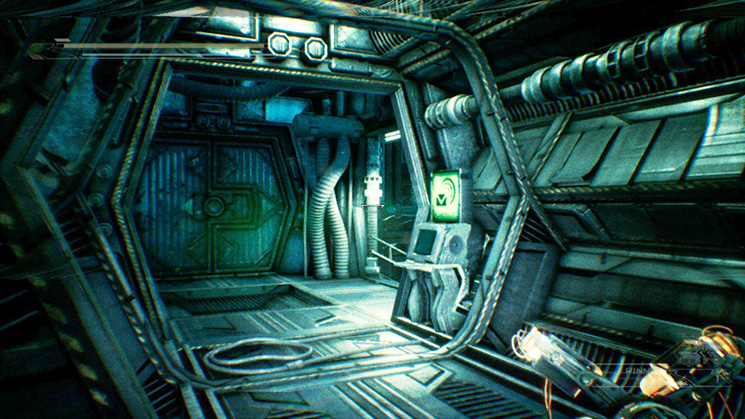
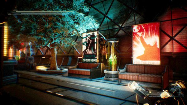
Just about every aspect of Hollow is irredeemably awful. This is apparent right from the get-go, when you discover that your options for the graphics are either making everything so dark that you can?t see a thing that?s going on, or you make it bright enough to actually be able to see your surroundings, and you discover that everything is all grainy and washed out. Theoretically, you could possibly call this an aesthetic choice, since it kind of conveys a retro, sci-fi vibe, but really, it?s just kind of ugly.
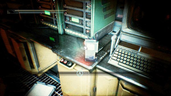
Things don?t get any better when you take control of your space marine. Your character crawls along at a snail?s pace at the best of times, with the only exception being when he speaks, at which point he essentially becomes immobile. Looking around isn?t any better — the camera also moves like it?s being dragged through molasses, perhaps so you can get a nice, long look at how hideous your surroundings are.
For me, Hollow?s map encapsulates just how wrong this game is on every level. In most cases, the game gives you a map so you can figure out where you are and where you?re going, and makes sure to give you an overhead view, since that?s the perspective which best conveys you in relation to your surroundings. Here, for whatever reason, the map is a) translucent, and overlaid over the screen, so you can?t ever get a good look at it, and b) shows you everything from your point of view — which is to say, flat and all around you. The feeling is akin to what it would feel like if you wanted to navigate around a city using Google Street View, only with everything being faintly coloured in and not giving you any sense of where anything is.
To Hollow?s credit, the one area where it doesn?t completely suck is in its enemies. The game promises gore in an opening title card, and that?s the one place where it delivers, with horrific-looking zombie-ish creatures with multiple appendages and wings sprouting out of their backs. True, these monsters carry with them at least a hint of misogyny, seeing as they?re all (admittedly terrifying) naked women (because zombies just have to have secondary sex characteristics, don?t you know), but given how awful the game is in every other respect, it?s hard to tell if that?s intentional, or if this game is just so bad that it manages to find ways to even give its slight positives an ?okay, but??
Not that it matters, of course. Hollow could have the most terrifying monsters ever chasing you through its dimly-lit hallways, and it would still suck on account of the fact that said chase would take place at the slowest speed imaginable, and give you ample opportunity to be reminded of what an eyesore it is. As I said up top, credit to the game for having such a clear vision of what it wanted to be, but the gulf between idea and execution couldn?t be any wider than it is here.
Forever Entertainment provided us with a Hollow Switch code for review purposes.


