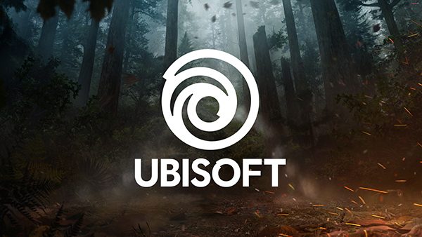
 After about 14 years or so, Ubisoft has finally redesigned their logo and “swirl”… for better or for worse.
Honestly, we kinda like it. It’s not overly simplistic but looks more modern. We assume we’ll start seeing it show up on newer game release packages and title screens. ANd yeah, let’s see how it looks in another decade or so.
See the new logo above, and head on over to the official Ubisoft blog for more details about their updating branding.

